2022
03.05
INTERVIEW
Encounter the beauty of a poster / KAZUNARI HATTORI
“Encounter the beauty of a poster” is a theme for the graphic designers who are a part of the project “POSTERS” . A journey about how they start paying attention to posters and its graphic, follow up to the works and projects that influenced them when they were young, until to their success and how they find their own way in creating.


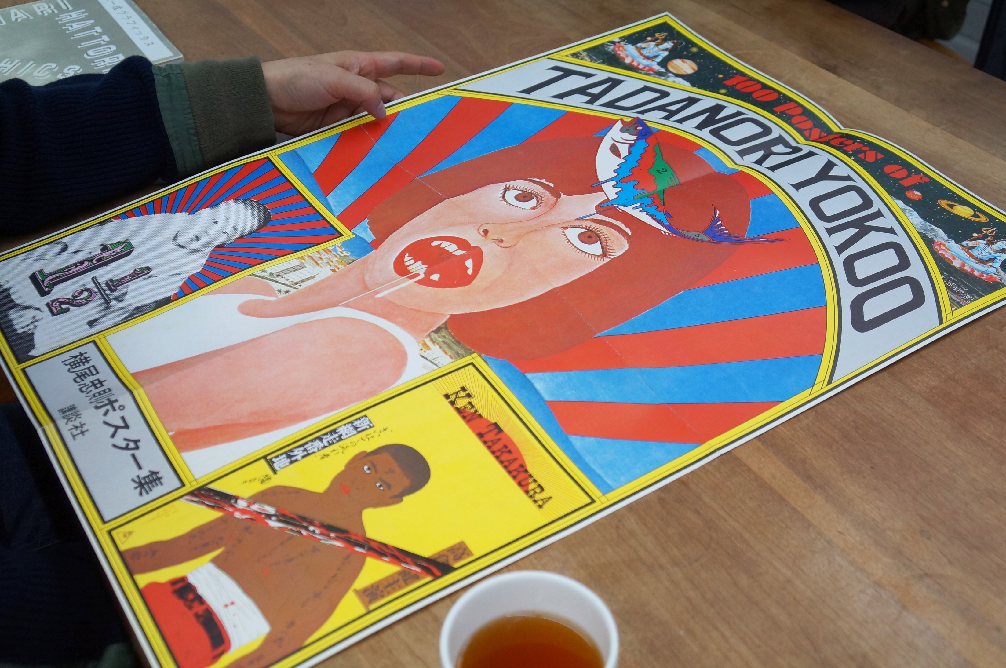
When I was in junior high school, my sister, who is four years older, gave me a poster of Eiko Ishioka. An advertisement for Parco, calls “A, Genten (Oh, Origin)” . I hung it in my room. That may have been my first memory about posters. I was still in junior high school, so I didn't really care about the work, but the act of putting up a poster in my room itself was cool for me. There was a period when I put up a poster of Tadanori Yokoo. My sister bought a book of Yokoo's works and gave me the poster as well. I think I was in high school, an age when teens would normally put up posters of rock musicians and idols. Still wonder what my parents would have thought when they saw a poster of a drooling woman (laughs). The content of the book was also interesting, I read the whole commentary by Koichi Tanigawa, who is a painter and critic.

When I was in prep school and college, I’ ve been close to Ikebukuro, so I used to get posters from Parco and Seibu Department Stores. There was a spot on the landing of the stairs at Parco where I could remove the posters without being spotted (laughs)
I especially liked the poster for the "Merry Christmas Mr. Lawrence" soundtrack, which was posted on the pillar of the Sanseido Bookstore. The poster was designed by Tsuguya Inoue. The unique trimming of Ryuichi Sakamoto's face, which has a rough image quality look alike a Polaroid shot, was exquisite and cool. At that time, I had no idea what kind of advertisement it was, I just looked at the poster and simply judged if it was cool or not. I guess I wasn't fully aware of the appeal of such media.

I often designed posters related to art. The original experience I had in high school was looking at posters for the Seibu Art Museum. Those were always designed by Ikko Tanaka. I realized, there was such a job where one designer designed series of posters for a museum. Since then I became aware of the work of a graphic designer.
In fact, the relationship between the artist's work and the design of the poster is quite difficult. It is also necessary to make the announcement strong and unique. Referring to my work, I think the poster for the German Photography Today exhibition at the National Museum of Modern Art, Tokyo, turned out pretty well. The exhibition introduces ten German photographers, and the names of the artists alone inevitably have a lot of text. While enumerating the names of the artists, I tried to compose the titles and photos of the works like a puzzle.

One of my own works is a series of flag posters that I made as part of the Toppan Printing project called "Graphic Trial” . It is still going on as a project to explore new printing expressions through poster production. It is a luxurious project where Toppan Printing tries to fulfill every desire for offset printing, whether it is multi-color printing or special inks. But at Light Publicity, where I used to work, we felt that being fussy about paper and printing was the work of bad designers. If you combine good photos and good copy with a good design, the rest is just normal printing on ordinary paper, more than that, it's useless and uncool... As a person who grew up at Light Publicity, I was a little troubled when I was told that I could spend as much time as I wanted.
I wondered if it would be possible to create a new printing expression without changing ordinary printing processes.


In the end, I replaced the basic CMYK four color dots of offset printing with straight lines, and created a work that forms a color surface by intersecting them at 45 degrees horizontally, vertically, and diagonally. At first, I was trying to express it with hand-drawn lines, my thought was that it would have a texture like a print. I traced the layout on the computer by hand, but the handwritten lines looked shaky and soggy. Shortly before handing it over, I quickly replaced with the layout I had designed on the computer.
I felt as if I had invented a way of expression, and for my solo exhibition six months later, I changed the motif to a cake. I don't have a specific message, neither the flag nor the cake has any meaning. The tricolor flag fits in with the color theme of the work. I like the curved lines swaying in the straight lines. The cake is a development into a three-dimensional motif. If printing is a method used to express a given theme, in this work the relationship is reversed: Themes are used to elaborate a printing method. In my work, printing overlapping parallel lines is the theme, for describing it I use simple graphics like flags or a cake.

