2022
03.23
INTERVIEW
Encounter the beauty of a poster / DAIJIRO OHARA
“Encounter the beauty of a poster” is a theme for the graphic designers who are a part of the project “POSTERS” . A journey about how they start paying attention to posters and its graphic, follow up to the works and projects that influenced them when they were young, until to their success and how they find their own way in creating.

I think I have been more familiar with small graphics than large posters. In terms of paper products, I'm talking about magazines, record jackets, flyers, and stickers. When I think back, I used to put up posters that were folded into magazines in my room.
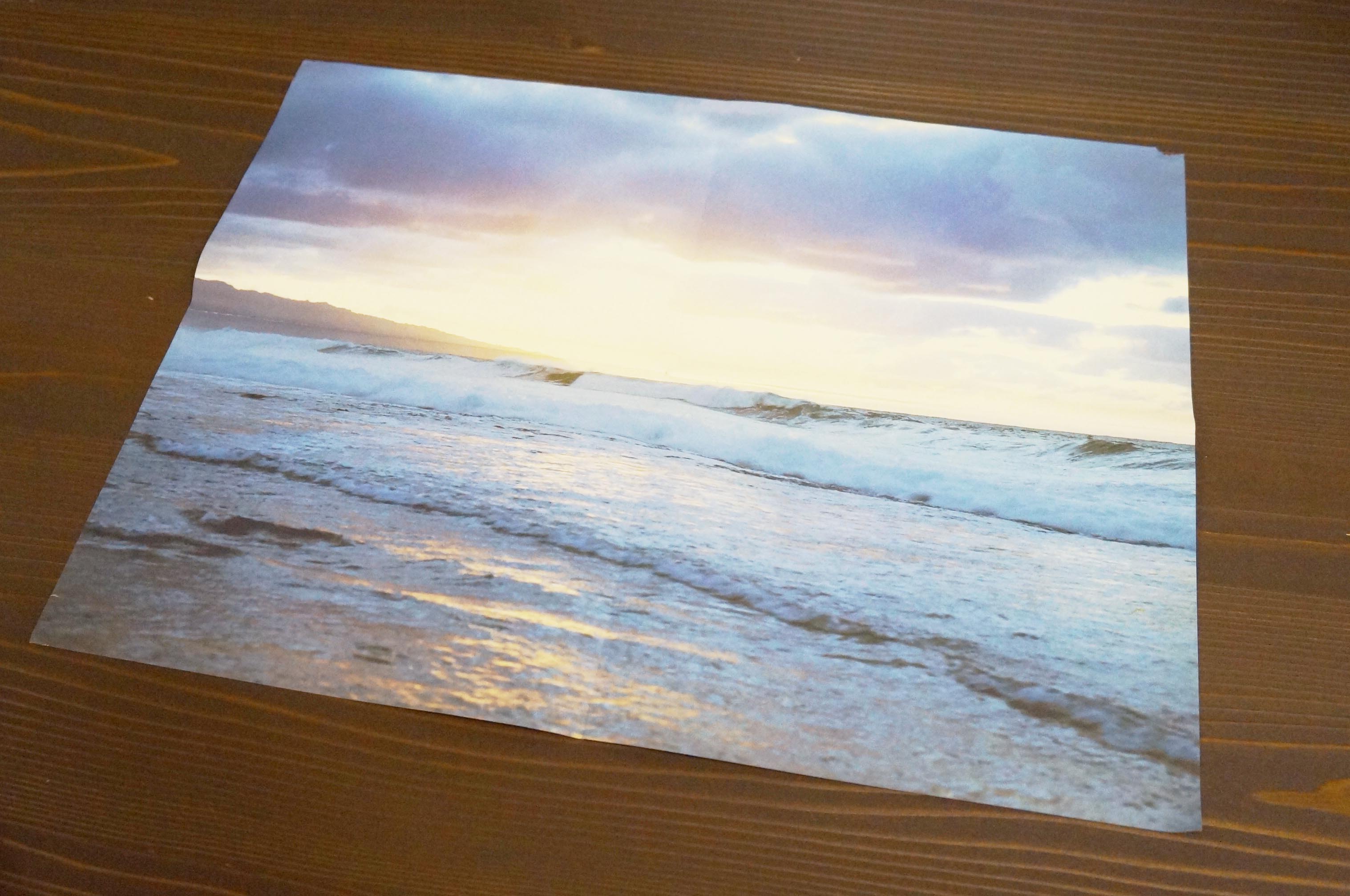
This is a poster of Takashi Homma that was attached on an issue (February 15, 2015 ) of BRUTUS magazine. It is from the "NEW WAVES" series that Homma has been photographing on the North Shore of Hawaii. Showing different pictures of waves printed on the front and back. (The design is by Eisaku Ono, who used to be the art director of "relax" magazine.)


When I was in high school, I used to make "Shonen Kuso Magazine", a kind of wall newspaper where me and my friends wanted to review the records we bought. One of my friends at that time was Latin Quarter (Karate Saiko), who is still active as a DJ and trackmaker. I designed the jackets for his cassettes. I used to make collages, nothing special, it was more a learning by doing. Therefore, I was also using Takashi Homma's photographs without permission. Coincidentally, I met him for the first time afterwards and was able to participate at associated art event of his exhibition "New Documentary Satellite Exhibition
For the satellite exhibition, I created a series of drawings based on Honma's mountain photographs and climbing maps. In 2013, I held an exhibition called Ridgeline Exhibition. The B2 size poster (offset + silkscreen) I made for the exhibition became my first self-produced poster.


The drawing of the ridge line, which is composed with the photograph, is based on a hiking map with the text and map number removed. Considering the relationship the photo and drawing, I used the method of reorganizing mountaineers' footprints instead of constructing my own letters and lines.
When I look at "Shonen Kuso Magazine" now, my ego was in full swing, now I can't even look at it because the execution was amateur (laughs). The way I express has been greatly influenced by my work with people involved in music. Translating music is an abstract thing that is hard to see as a visual form, it’ s sometimes required to have a kind of reading comprehension for sound. Both the artist and the listener are sensitive to misalignment and discomfort. The experience of exploring the distance between music and graphics has been a great source of inspiration.
The new posters I created for "POSTERS" are a series of observations of fixed-points in everyday scenes. It is actually an imaginary landscape generated by a real-time renderer used in online games. It's like a sense of déjà vu: The suburban landscape, with an accidentally captured UFO like structure in a photograph. “The will of not missing anything” or "the act of capturing something alive” is what I want to achieve through the rendering process.
Regarding the layouts of my posters, I thought about the calendars that often hung in my parents' house. I used this model to create a picture at the top and the concept of time (the long and short hands of a clock) at the bottom. The series consists of different settings of seasons and times of day, with different shades of light, expressions of mobiles and shadows, even in landscapes with the same point of view. It is a series of mobiles with different illuminations, expressions and shadows.

